
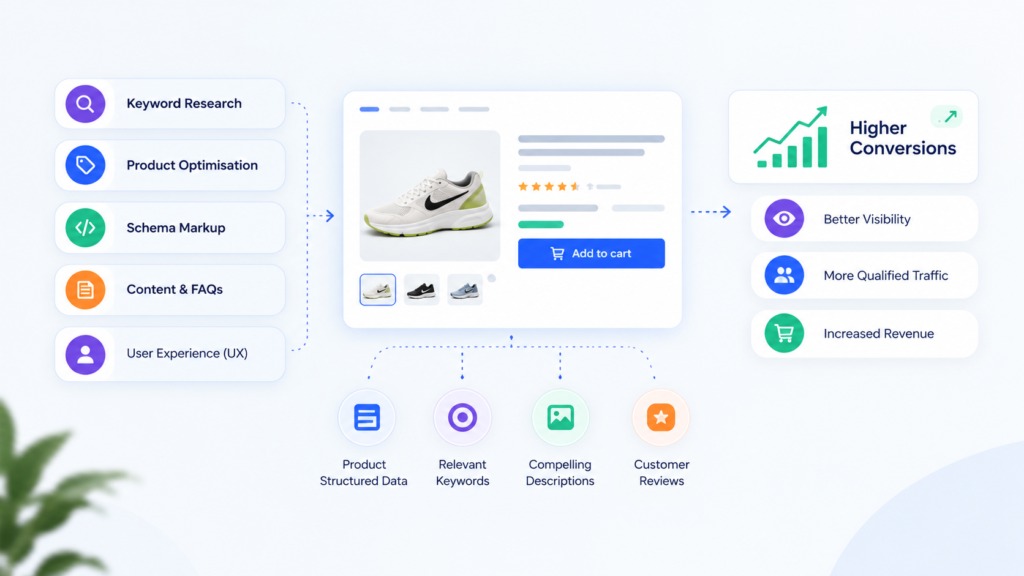
A product page has one job: turn a qualified visit into a confident buying decision. That is why knowing how to optimise product pages is less about adding persuasive copy and more about removing the unanswered questions that stop revenue. If a shopper still has to hunt for sizing, delivery timing, compatibility, proof or returns information, the page is making them do work it should have already done.
For Australian ecommerce teams, product page optimisation sits at the intersection of search visibility, merchandising and conversion rate optimisation. Traffic quality still matters, but even highly targeted paid media cannot compensate for a product detail page that creates uncertainty.
Key takeaways
- Build each page around the buyer’s decision, not the internal product catalogue.
- Prioritise clarity on price, availability, variants, delivery and returns before adding more promotional language.
- Treat reviews, imagery, specifications and FAQs as decision-support assets, not page decoration.
- Measure product-page performance by product type, device and traffic source. Site-wide averages hide expensive problems.
Start with the commercial diagnosis
Before redesigning anything, establish where the page is losing demand. A low add-to-cart rate can mean weak product-market fit, poor traffic targeting, an uncompetitive offer or a page-level friction point. The remedy depends on the cause.
Use a simple funnel calculation:
Product page conversion rate = orders from product-page sessions ÷ product-page sessions × 100
Then separate the journey into product view, variant selection, add to cart, checkout start and purchase. If product views are high but variant selection is weak, the issue may be sizing, stock availability or confusing option labels. If shoppers add to cart but do not begin checkout, surprise delivery costs or a vague returns policy may be the real problem.
Analyse this by mobile versus desktop, new versus returning users, category and acquisition channel. A premium skincare product, a replacement auto part and a $30 fashion item require different levels of reassurance. There is no universal best product page, only a page that answers the right questions for that purchase.
Baymard Institute’s ongoing ecommerce research reports an average cart abandonment rate of 70.19%. Product pages do not explain all of that abandonment, but they heavily influence whether a shopper enters checkout with enough confidence to finish it.
How to optimise product pages for faster decisions
Lead with the information that changes a purchase
The top of the page should make the product instantly legible. A shopper should be able to identify what it is, who it is for, its price, selected variant, availability and primary reason to buy without scrolling through brand language.
Strong product titles balance search relevance with shopper comprehension. “Men’s Waterproof Trail Running Shoe” is more useful than an internal collection name, particularly when the product has technical attributes. The description beneath it should translate features into the outcome the customer receives. A waterproof membrane is a feature; dry feet on wet morning runs is the benefit.
Avoid hiding material details, compatibility limitations or care requirements in accordions simply to create a cleaner layout. Progressive disclosure works for secondary information, but the information that can invalidate a purchase belongs close to the buying controls.
Make variants hard to get wrong
Variant friction is one of the quietest conversion killers. Size, colour, bundle, finish and subscription options can materially change both price and suitability. If customers cannot see what is selected, what is sold out or what changes when they choose an option, they hesitate or leave.
Use plain-language labels, show unavailable choices clearly and update imagery, price and stock messages immediately when a variant changes. For categories with high sizing uncertainty, place a useful fit guide beside the size selector rather than burying it lower on the page. For technical products, compatibility should be a selection tool, not a paragraph customers have to interpret.
There is a trade-off here. Too many swatches, badges and tooltips can make the buying area feel crowded on mobile. The goal is not maximum information. It is minimum ambiguity.
Give images a job beyond looking good
Product images need to reduce the gap between expectation and delivery. Studio photography is often necessary, but it rarely answers practical questions on its own. Shoppers also need scale, texture, fit, use context and close-ups of the details that justify the price.
For apparel, show the garment on models with stated sizing and height. For furniture, show it in a recognisable room setting and include dimensions visually. For electronics, show ports, contents of the box and key interfaces. Video can help where movement, assembly or application changes the decision, but a slow autoplay video is not an automatic conversion lift.
Image performance matters as much as image quality. Compress assets, use modern formats where supported and prevent layout shifts as media loads. Google has consistently made clear through its Search Central guidance that page experience and crawlable content affect how pages perform in search. Large visual assets that slow mobile pages can damage both discoverability and conversion intent.
Put trust next to the moment of commitment
Trust signals work best when they resolve an actual concern. A generic “secure checkout” badge under every button is less useful than a clear delivery estimate for a shopper deciding whether a gift will arrive in time.
Place the most relevant proof near the add-to-cart area: dispatch timing, delivery thresholds, returns terms, warranty coverage, payment options and stock confidence. Be specific. “Easy returns” is vague; “30-day returns with prepaid labels for metro orders” is understandable, provided it is accurate.
Reviews deserve the same discipline. Display the average rating and review count near the title, then make reviews filterable by product-relevant attributes such as size, skin type, vehicle model or room size. A mix of positive and critical feedback can be more credible than a page that appears selectively curated. If review volume is low, do not manufacture social proof. Better product education is the appropriate response.
Build for search, shopping feeds and AI-assisted discovery
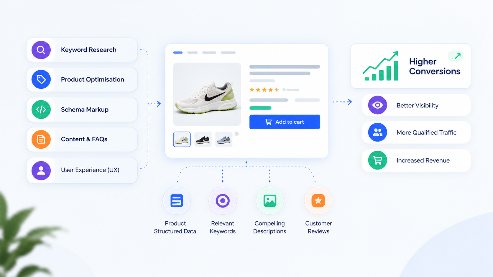
A product page should be a complete, indexable source of product truth. Search engines, shopping platforms and AI-assisted discovery tools need consistent signals about the product name, price, availability, images, reviews and specifications.
Ensure every indexable product has a unique title, useful description, canonical URL and structured product data that reflects what shoppers can actually see. Structured data is not a shortcut to rankings, but it reduces ambiguity and can support richer product appearances when search engines determine the page is eligible.
Avoid copying manufacturer descriptions across hundreds of products. Duplicate copy gives search engines little reason to prioritise your version and gives customers no reason to trust your expertise. Add useful original detail: Australian use cases, measurement guidance, comparison notes, care advice or buying considerations.
For discontinued or out-of-stock products, the right approach depends on demand. Keep a temporarily unavailable product page live when it has search equity and a realistic replenishment date. Offer an email notification and relevant alternatives. Redirecting every unavailable product to a category page can frustrate shoppers and remove valuable long-tail visibility.
Test the highest-friction assumptions first
Product-page testing should begin with evidence, not button colour debates. Combine analytics with session recordings, on-site search terms, customer-service tickets, return reasons and review themes. Repeated questions are a research backlog in plain sight.
Useful test hypotheses are specific and commercial. For example: showing an estimated delivery date above the add-to-cart button will increase checkout starts for regional customers; or adding a compatibility checker will reduce returns for replacement parts. Define the audience, expected behavioural change and success metric before development starts.
Do not judge a test solely on conversion rate. A change that lifts add-to-cart rate but increases returns, support contacts or discount dependence may not improve profit. For higher-consideration products, track revenue per session, gross margin, return rate and repeat purchase where possible.
This is where a conversion rate optimisation discipline earns its keep: not by chasing cosmetic gains, but by identifying the constraint with the greatest revenue impact and validating the fix.
A practical product-page prioritisation framework
Score opportunities against four questions: how many sessions reach the page, how large the observed friction is, how valuable the product is to margin or lifetime value, and how confidently the team can diagnose the cause.
A low-traffic page with a small usability issue should not outrank a high-volume category where mobile shoppers cannot understand delivery timing. Equally, a high-ticket product with a poor add-to-cart rate may justify deeper qualitative research even if its session volume is modest.
Start with one category or product archetype, document the learning, then roll proven changes out carefully. Templates are efficient, but they can flatten meaningful differences between product types. The page for a replenishable consumable should not ask customers to make the same decisions as the page for a technical, high-consideration purchase.
The strongest product pages do not feel aggressively optimised. They feel like a capable salesperson anticipated the question before the shopper had to ask it. Build that level of clarity into the page, measure what changes, and let commercial evidence decide what scales.