
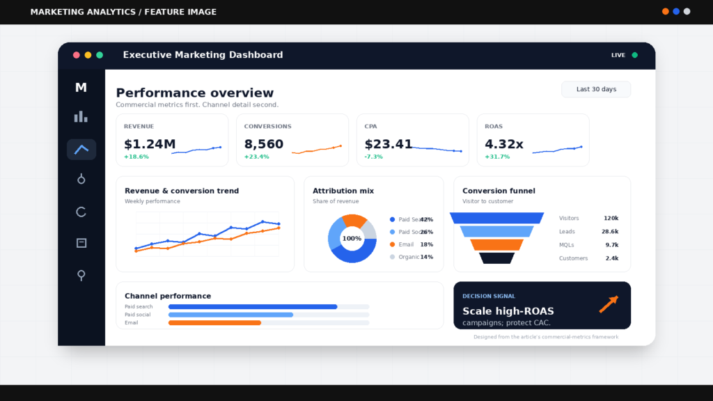
A dashboard should make the next decision obvious. If your weekly marketing report ends in a debate over which number is right, or a spreadsheet hunt for last month’s spend, it is not a decision tool. It is administrative overhead. Knowing how to build marketing dashboards that bring spend, customer behaviour and commercial outcomes into one view is a material advantage for growth teams.
The objective is not to display every available metric. It is to create a reliable operating system for marketing performance: one that tells a founder whether acquisition is profitable, a CMO where budget should move, and a marketing manager what to investigate before the next campaign cycle.
Start with the commercial question, not the data source
Most dashboards fail before anyone opens Looker Studio, Power BI or a spreadsheet. Teams start by connecting platforms, then add every metric those platforms expose. The result is a colourful collection of impressions, clicks and engagement rates that says little about business performance.
Start with the decision the dashboard must support. For an eCommerce business, that may be whether paid acquisition is producing profitable first orders and repeat customers. For a lead-generation business, it may be whether search and paid media are generating qualified pipeline rather than cheap form fills.
Write the dashboard’s purpose in one sentence. For example: “This dashboard shows whether marketing investment is generating profitable, qualified customer acquisition by channel.” That sentence becomes a filter. If a metric does not help answer it, it does not belong on the executive view.
A useful dashboard also needs a defined audience. A CEO does not need a keyword-level breakdown every morning. A paid media specialist does. Build different views for different operating rhythms rather than forcing one dashboard to serve everyone.
The metrics hierarchy that keeps dashboards useful
Marketing data becomes commercially useful when it moves from outcomes to drivers. The top of the dashboard should show business results. The lower sections should explain why those results moved.
| Layer | What it answers | Example metrics |
|---|---|---|
| Business outcome | Did marketing create value? | Revenue, gross profit, qualified pipeline, new customers |
| Unit economics | Was growth efficient? | Customer acquisition cost, return on ad spend, contribution margin, customer lifetime value |
| Channel performance | Where did performance come from? | Spend, conversions, cost per acquisition, conversion rate |
| Diagnostic signals | What needs investigation? | Landing page conversion rate, impression share, frequency, lead-to-sale rate |
This hierarchy prevents a common reporting error: celebrating lower-funnel activity without checking its commercial quality. A campaign may produce a low cost per lead while delivering poor-fit enquiries that the sales team cannot close. Equally, a high cost per acquisition may be acceptable where customer lifetime value, gross margin and retention justify it.
Use formulas that reflect your actual economics. Customer acquisition cost is typically calculated as marketing and sales acquisition costs divided by new customers acquired. But the definition matters. If agency fees, creative production, discounts, payroll or sales costs are excluded, label the metric clearly. A precise but incomplete CAC can still create poor budget decisions.
For eCommerce, revenue alone is also an imperfect headline. Consider contribution after advertising spend, fulfilment and variable costs where those figures are available. For lead generation, use CRM stages such as marketing-qualified lead, sales-qualified lead, opportunity and won revenue. That is how a dashboard moves from platform reporting to board-level intelligence.
How to build marketing dashboards in seven steps
1. Set reporting definitions before building visuals
Create a short measurement specification. Define what counts as a conversion, new customer, qualified lead, attributed revenue and marketing spend. Record the source of truth for each metric and the time zone used.
This sounds procedural, but it eliminates expensive confusion. Meta, Google Ads, GA4 and a CRM can each report different conversion totals because they use different attribution logic, reporting dates and identity signals. Those differences are not necessarily errors. They become a problem when they are presented as directly comparable without context.
2. Map the customer journey and data hand-offs
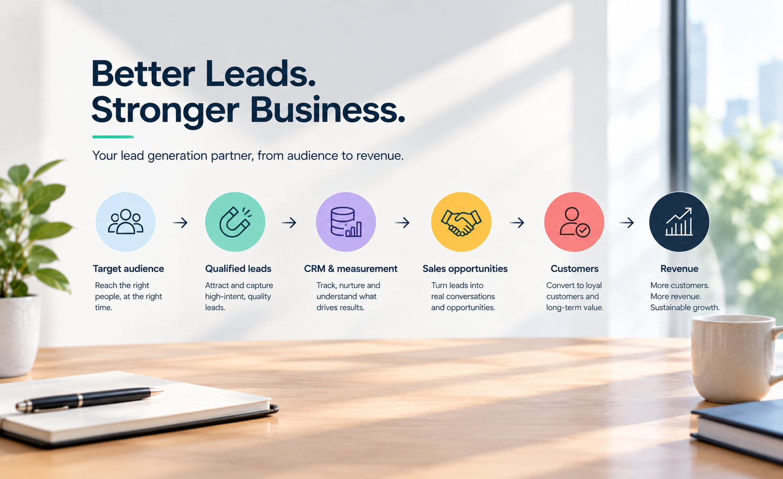
Identify how a person moves from first interaction to revenue. This could include paid search, organic search, social, email, website form, CRM, sales call and purchase. Then map where each event is recorded.
The practical goal is to expose breaks in measurement. A form submission tracked in GA4 but not passed into the CRM cannot reveal lead quality. A purchase recorded in Shopify without reliable source data makes channel-level revenue harder to interpret. Use consistent campaign naming, UTMs and CRM source fields to preserve that connection.
3. Choose a source of truth for each number
Do not blend data simply because it is available. Each source has a job. Advertising platforms are best for delivery and spend. Analytics platforms are useful for site behaviour and tracked digital conversions. A CRM should own lead status, pipeline and closed revenue. Your commerce platform or finance system should own orders, refunds and margin.
Where figures conflict, show the metric from the system closest to the business event. For example, use the CRM for won revenue rather than an ad platform’s reported conversion value. Keep platform-attributed revenue available as a diagnostic measure, but do not mistake it for audited commercial truth.
4. Build the executive page first
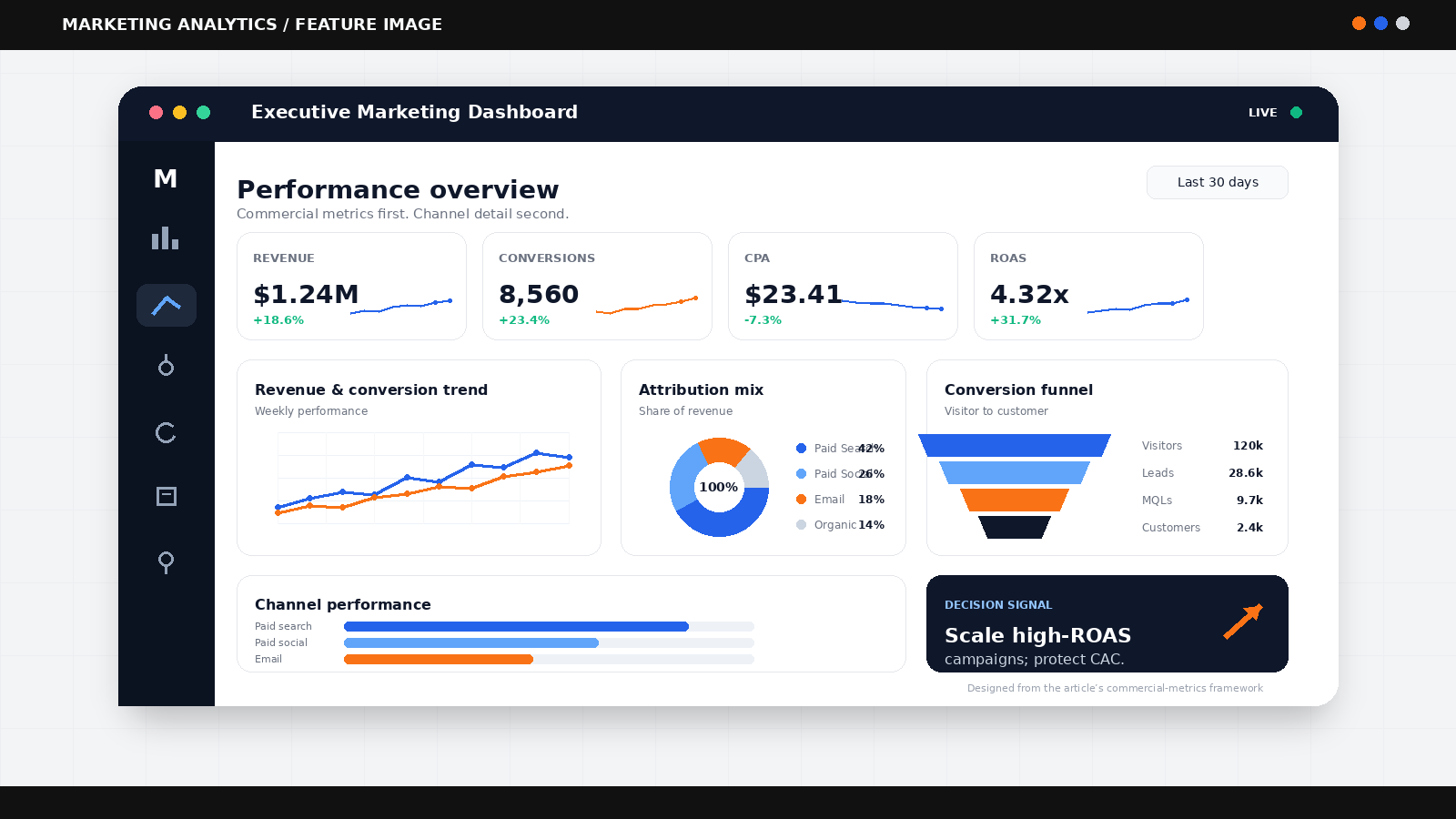
The first page should be readable in under a minute. Show the reporting period, comparison period, spend, primary outcome, efficiency measure and a concise channel split. Add targets where they exist, not arbitrary green and red indicators.
A good executive page answers three questions: Are we on track? What changed? Where should we act? If it takes multiple charts to explain one answer, simplify the design or move detail into a channel page.
5. Add drill-down views for action
The second layer is for the people managing performance. Paid media views may segment campaigns by objective, audience, creative, device and landing page. Search views may show non-brand and brand performance separately. CRM views should show lead progression and time to conversion.
Separate prospecting from remarketing where possible. Combining them often overstates the apparent efficiency of acquisition activity, particularly for brands with established demand. The right segmentation depends on your model, but the principle is stable: do not let blended averages hide a material difference in intent.
6. Design for comparison, not decoration
Every major number needs context. Compare against a relevant prior period, target, forecast or baseline. Monthly comparisons can be misleading for seasonal businesses, while week-on-week views may overreact to normal volatility. Australian retailers, for example, should account for major promotional periods, public holidays and end-of-financial-year trading patterns.
Avoid gauges, crowded pie charts and decorative scorecards. Trend lines, tables with variance columns and clear annotations usually make performance easier to read. Use colour sparingly to signal a genuine exception or decision point.
7. Put the dashboard into a management cadence
A dashboard does not improve performance on its own. Tie it to a recurring routine. Review the executive view weekly or fortnightly, investigate the largest changes, assign actions, and record the hypothesis behind each material budget or creative decision.
This creates a feedback loop. Over time, the dashboard becomes more than reporting. It becomes a record of what the business tested, what changed and which levers genuinely moved revenue.
Manage attribution honestly
Attribution should inform decisions, not create false certainty. Platform reporting can over-credit channels that close demand, while last-click analytics can understate the role of awareness activity, creative and upper-funnel search behaviour.
Use multiple views of performance. Compare platform attribution, analytics attribution, CRM or commerce revenue, and blended measures such as total marketing spend against total new customers or total revenue. If all views move in the same direction, confidence increases. If they diverge, investigate before reallocating budget aggressively.
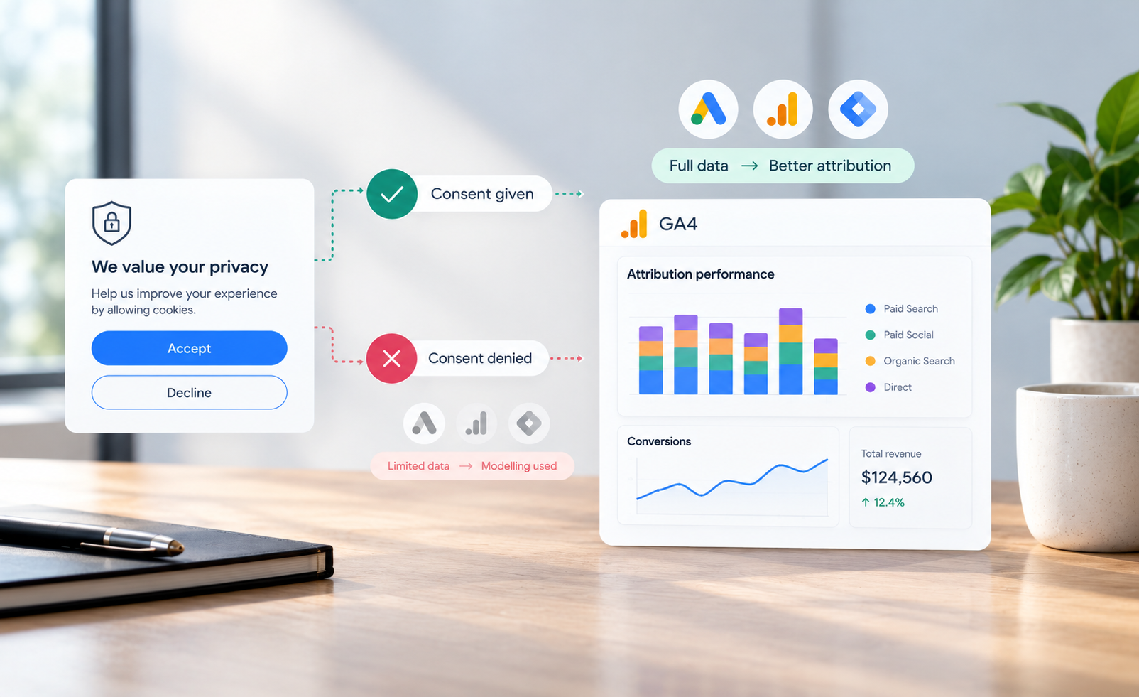
Privacy controls, cookie restrictions and consent choices mean no dashboard will capture every customer journey perfectly. The answer is not to wait for perfect data. It is to document the limitations, use consistent measurement rules and make decisions based on patterns across several credible signals.
For technical implementation, Google’s GA4 measurement documentation and the IAB Australia guidance on digital advertising measurement are useful reference points. They will not define your commercial model, but they can help teams apply consistent collection and reporting practices.
The dashboard mistakes that waste the most time
The first is reporting too many metrics. More data increases cognitive load and creates opportunities to find a flattering number rather than the relevant one. The second is treating channel dashboards as a substitute for CRM or finance data. Campaign performance cannot be judged properly if downstream quality is invisible.
The third is ignoring data freshness. A live dashboard is not automatically better. If revenue data reconciles overnight, label it as such. A reliable daily view is more valuable than a supposedly real-time one that changes materially after reconciliation.
Finally, avoid building a single static dashboard and calling the job complete. New products, changing margins, updated CRM stages and shifts in channel mix all require periodic review. Revisit the measurement specification at least quarterly and whenever the business changes how it sells.
The best marketing dashboards are deliberately selective. They turn fragmented activity into a shared commercial view, make weak signals easier to spot, and give teams the confidence to move investment before wasted spend becomes a monthly surprise.