
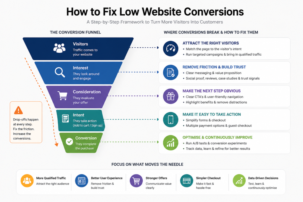
A site can attract thousands of visitors and still fail commercially. That is not a traffic problem. It is a decision problem happening between the first click and the next action. Knowing how to fix low website conversions starts with identifying where qualified buyers lose confidence, lose momentum, or realise the page is not for them.
Conversion rate optimisation is not a cosmetic exercise. It is the discipline of turning existing demand into more leads, sales, and revenue without automatically increasing acquisition spend for Australian businesses facing rising media costs, making it one of the highest-leverage growth activities available.
Start with the conversion maths, not the homepage
A conversion rate is simply:
Conversions / total sessions x 100
But a single site-wide figure can conceal the real issue. A 2% conversion rate could be strong for a considered B2B service with a $50,000 contract value, yet weak for a low-cost eCommerce product. It also tells you nothing about traffic quality, device behaviour or whether returning visitors convert very differently from first-time visitors.
Before changing buttons, colours or copy, segment performance by channel, campaign, landing page, device, location and new versus returning users. A sharp drop in paid social traffic may point to audience-message mismatch. Poor mobile conversion on a product page is more likely a usability, speed or checkout issue. Strong branded-search conversion but weak non-branded conversion often means the site depends on people who already trust you.
The question is not, “What is our average conversion rate?” It is, “Which high-value audience is failing to complete which action, and why?”
Check the integrity of your data first
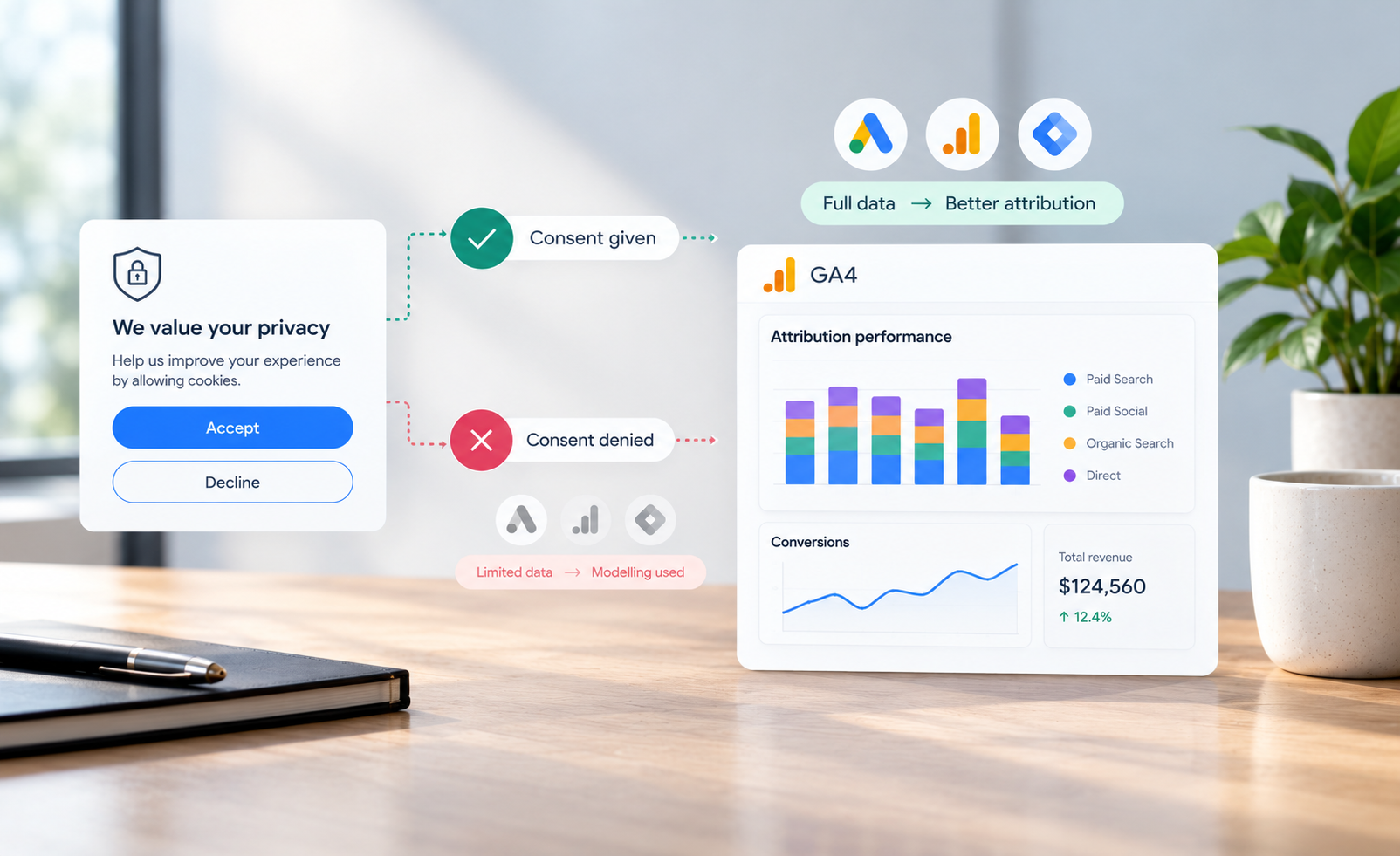
Broken measurement creates expensive decisions. Confirm that lead forms, phone-click events, purchases, payment failures, consent mode and cross-domain checkout tracking are recording correctly. Compare analytics transactions with your eCommerce platform or CRM, allowing for timing differences and cancellations.
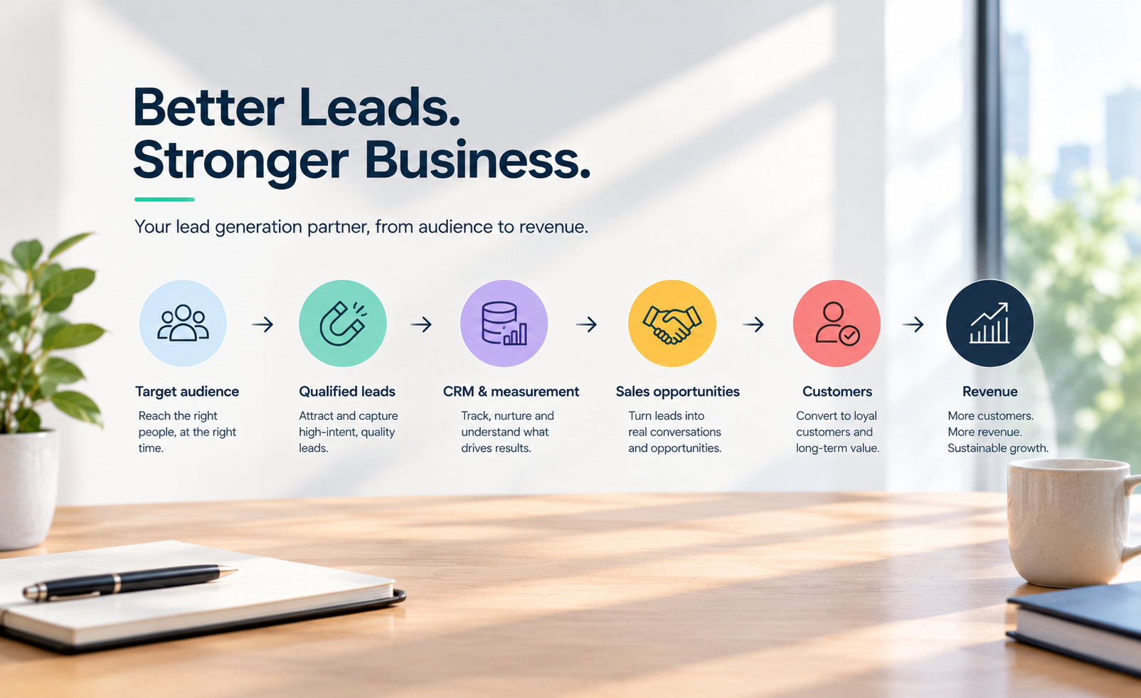
For lead generation, a submitted form is not necessarily a valuable conversion. Connect marketing data to CRM outcomes where possible. Track qualified leads, sales opportunities and revenue, not just the easiest action to count. A campaign that generates fewer form fills, but more sales-ready enquiries is usually the better investment.
Find the friction with evidence
Low website conversions rarely have one universal cause. Use quantitative data to identify where the problem occurs, then use qualitative evidence to understand it.
Your analytics should show the pages with high entrances and unusually high exits, landing pages that underperform their traffic source, and the specific step where checkout or form completion drops away. Session recordings, heatmaps, on-site surveys, customer-service logs and sales-call notes add the context analytics cannot provide.
Ask recent buyers one useful question: “What nearly stopped you from going ahead?” Ask non-converters what information was missing. Their language is often more commercially useful than internal opinions about what the site needs.
Baymard Institute’s long-running checkout research consistently identifies avoidable checkout complexity, unexpected costs and forced account creation among common reasons shoppers abandon carts. The exact priority depends on your business, but the broader lesson applies everywhere: customers leave when effort, risk or uncertainty becomes greater than the perceived value of continuing.
Match the page to the visitor’s intent
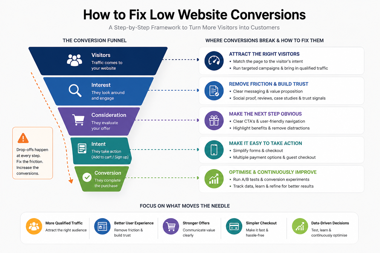
A landing page should continue the promise made by the ad, search result, email or referral that sent the visitor there. Too many campaigns deliver a specific offer, then dump the user on a broad homepage and expect them to find the relevant path themselves.
If someone searches for “commercial solar installation Melbourne”, they need proof that you handle commercial projects, understand local requirements, can scope the work and have delivered comparable outcomes. A generic page about sustainability will not do the job, no matter how polished it looks.
This is where businesses often confuse brand messaging with conversion messaging. Brand establishes recognition and preference over time. Conversion pages must also answer immediate questions: Is this relevant to me? What will I get? Why should I believe you? What happens next?
Lead with the customer outcome, then support it with specificity. Replace vague claims such as “tailored solutions” with concrete signals: project types, turnaround times, service areas, compatible platforms, starting price ranges where appropriate, or the operational problem you solve.
Make the next step feel obvious and low risk
A call to action is not just a button. It is an exchange. The visitor is deciding whether the time, data or commitment required is justified by the expected return.
“Submit” communicates nothing. “Get a 15-minute project estimate” tells the user what happens next. For higher-consideration services, “Request a strategy call” may still feel too large if the page has not earned that commitment. A useful interim action could be a pricing guide, a project calculator or a request for a tailored scope.
Do not create choice overload. Each important page should have one primary conversion action, with a secondary option only when it serves a genuinely different readiness level. An eCommerce product page may need “Add to cart” and a way to review delivery details. A B2B service page may need “Book a consultation” alongside “View case studies”. Five equally prominent actions dilute attention.
Remove the trust gaps that stop conversion
Visitors assess risk quickly, particularly when they do not know your business. Trust is built through evidence, not a row of generic icons.
Use testimonials that name the customer, their context and the result where permission allows. Show relevant case studies, independent reviews, accreditation, secure payment information, delivery and returns policies, clear contact details and realistic photography of people, products or work. For service businesses, explain the process after enquiry. Silence around what happens next makes a form feel like a commitment to a sales ambush.
Trust signals need to sit near the decision point. A testimonial hidden on an About page does little to reassure someone hesitating at checkout. Similarly, a refund policy buried in the footer will not resolve a delivery concern on a product page.
There is a trade-off. Excessive badges, pop-ups and proof points can make a page look defensive or cluttered. Prioritise the evidence most relevant to the purchase risk. A high-value service buyer may care about comparable results and senior expertise. An online shopper may care more about delivery timing, returns and payment security.
Treat mobile speed and forms as revenue infrastructure
Mobile users are often more distracted, less patient and working with less screen space. Test key journeys on an actual mobile, not only a desktop browser preview. Can a visitor understand the offer without scrolling excessively? Can they see the price, delivery information and primary action without hunting? Does the keyboard obscure form fields? Does a sticky chat widget cover checkout controls?
Google’s web performance guidance uses Core Web Vitals to assess user experience, including loading performance, interactivity and visual stability. These metrics are useful diagnostic signals, but the commercial standard is simpler: does the page become usable quickly enough for a buyer to act?
Forms deserve the same scrutiny. Every field creates effort and potential doubt. Remove anything that is not necessary for the next sales action. If the sales team can qualify company size on a call, do not make it mandatory on the first enquiry form. For checkout, offer guest purchase and minimise manual data entry where your platform supports it.
Run conversion experiments that can teach you something
Once you have identified a credible friction point, form a hypothesis. For example: “Adding delivery dates and returns information beside the add-to-cart button will increase completed purchases from mobile users because it reduces fulfilment uncertainty.”
That is stronger than deciding to “test a new design”. It defines the audience, change, expected behaviour and reason. Measure the primary conversion, but also monitor guardrail metrics such as average order value, qualified-lead rate, refund rate and page speed. A change that increases cheap leads while reducing sales quality is not a win.
Prioritise experiments using three practical factors: expected impact, confidence in the evidence and implementation effort. Start with pages that receive meaningful qualified traffic and sit closest to revenue. A minor footer change may be easy, but improving a high-traffic checkout step usually has greater upside.
Avoid declaring a winner after a handful of conversions. Small samples produce noisy results, especially for B2B sites. Where traffic is limited, pair controlled testing with user research, sales feedback and before-and-after monitoring. The goal is better decisions, not false statistical certainty.
Build a conversion programme, not a redesign cycle
Full redesigns can be necessary when technology, brand or user needs have materially changed. But they are often used as a substitute for diagnosis. They also introduce risk: changing navigation, messaging, templates and tracking all at once makes it difficult to know what improved performance or caused it to decline.
A better operating model is continuous: measure the funnel, identify the largest constraint, research the cause, make a focused change, assess the outcome, then repeat. Keep a record of hypotheses and results so the business compounds learning instead of revisiting the same debates every quarter.
Low conversion rates are rarely fixed by a clever headline alone. Revenue moves when a business reduces friction for the right audience, proves its value at the moment of doubt and measures success beyond superficial clicks. Start with the page closest to revenue and the clearest evidence of hesitation. That is where better marketing decisions become measurable growth.