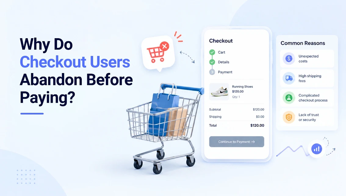

A customer who reaches checkout has already done the hard work: they found the product, accepted the price and showed intent to buy. When they leave at this point, the question is not simply, “Why do checkout users abandon?” It is where the buying decision lost certainty.
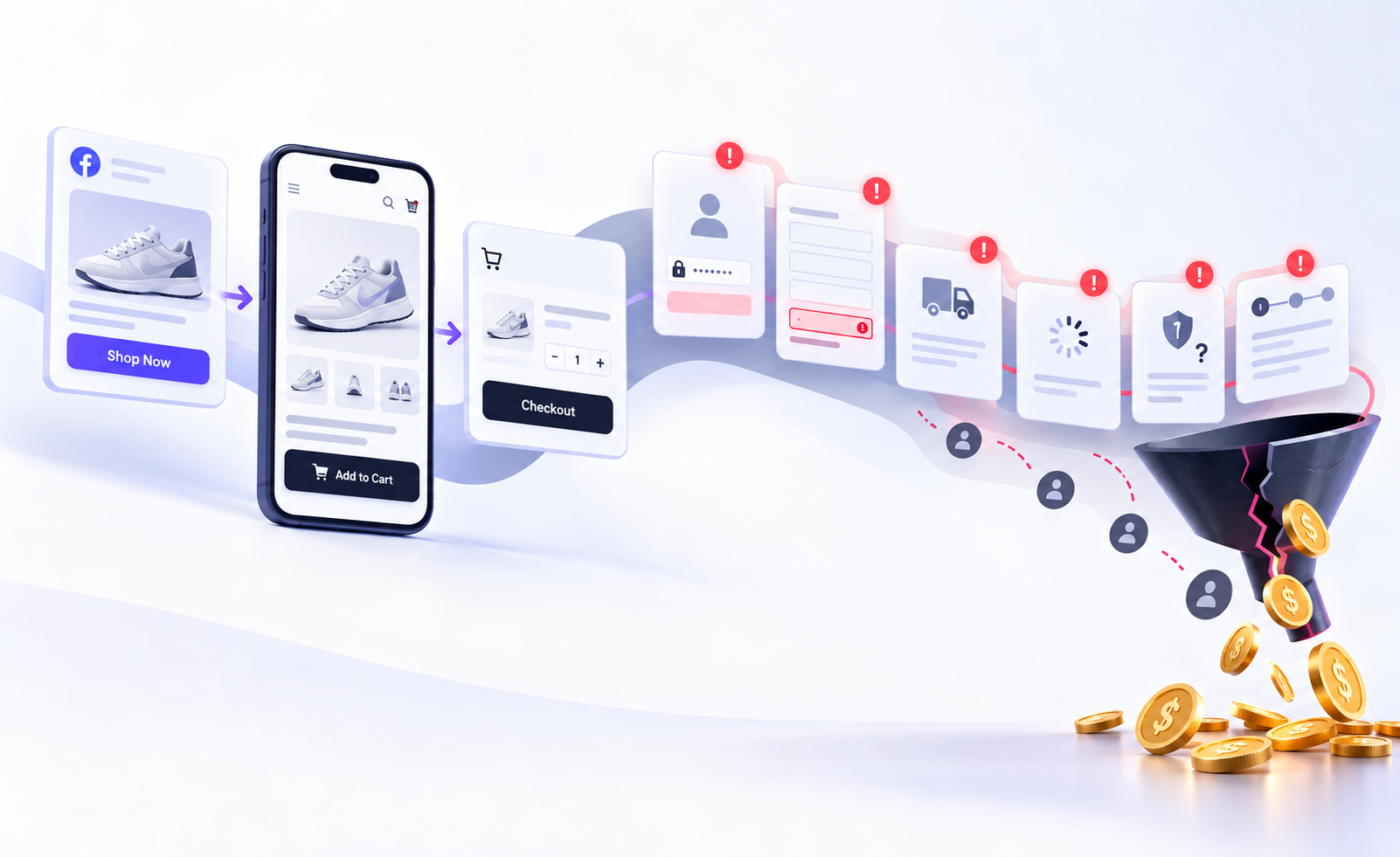
Checkout abandonment is rarely caused by one dramatic flaw. More often, a series of small doubts compounds: an unexpected delivery fee, a password request on mobile, a missing payment option, or an error message that offers no way forward. For eCommerce operators, these are revenue leaks with a clear path to fix.
Key takeaways
- Treat checkout abandonment as a diagnosis problem, not a generic conversion-rate problem.
- Separate expected hesitation, such as delivery timing, from avoidable friction, such as forced account creation or form errors.
- Start with the highest-intent failures: payment errors, unclear totals and mobile usability.
- Use qualitative evidence alongside analytics. A funnel shows where users leave; session recordings, surveys and testing help explain why.
Why do checkout users abandon? The evidence behind the exit
Cart abandonment and checkout abandonment are often used interchangeably, but they describe different behaviours. A shopper who leaves a cart may be comparing products, saving an item for later or responding to a promotion. A shopper who exits after entering delivery details or selecting payment is much closer to a completed transaction. That makes checkout friction especially valuable to investigate.
Baymard Institute’s consumer survey research consistently identifies extra costs, such as shipping, tax or fees, as the leading stated reason for abandonment. Slow delivery, a lack of trust with card details, mandatory account creation and a long or complicated checkout also feature prominently. These are useful directional benchmarks, not a substitute for a brand’s own data. The survey responses are largely drawn from US consumers, while Australian delivery expectations, payment preferences and regional coverage can change the pattern.
The commercial point remains the same: checkout users abandon when the final experience creates more perceived effort, risk or cost than the purchase feels worth.
A practical way to frame this is:
Completed orders = checkout starts × payment completion rate
Improving traffic will not compensate for a weak payment completion rate. If 10,000 users start checkout each month and 55% complete it, lifting completion to 60% creates 500 extra orders without buying another visit. The revenue impact depends on average order value and margin, but the opportunity is usually material enough to warrant disciplined testing.
This is where conversion rate optimisation becomes commercially valuable: identifying where high-intent users encounter friction and testing changes that improve completion without simply increasing traffic.
The five friction categories worth investigating
1. The total changes too late
Unexpected costs are not merely a pricing issue. They are an expectation-management failure. A product priced at $80 can feel acceptable until a shopper sees $15 shipping added at the final step, especially when delivery is slow or the retailer’s policy was hard to find earlier.
Show a credible delivery estimate and cost as early as possible, ideally on the product page and again in the cart. These pages are among the eCommerce revenue assets closest to the purchase decision, so delivery information should be treated as part of the selling experience rather than a checkout detail. If a postcode is required for accuracy, explain why. Avoid vague copy such as “calculated at checkout” when a meaningful estimate can be provided sooner.
There is a trade-off. Free shipping thresholds can lift basket size, but they can also push customers into adding unwanted items or leaving to find a better offer. Test threshold messaging against a clearly priced standard-delivery option rather than assuming free shipping is always the answer.
2. The checkout asks for too much work
Every field is a request for effort and personal information. Long forms are particularly damaging on mobile, where switching between address lookup, email, password and card fields is tedious. This is one reason mobile conversion should be analysed separately rather than hidden inside an overall site conversion rate.
Guest checkout should be prominent. Account creation can follow a purchase, when the value is obvious, and the customer has already received something in return. Requiring a password before payment forces shoppers to choose between convenience and commitment at the worst possible moment.
Review every field with a blunt question: is this necessary to fulfil the order, prevent fraud or support a legal requirement? If not, remove it. Use address autocomplete, sensible keyboard types, inline validation and clear error copy. “Invalid input” does not help a buyer recover. “Enter a 10-digit Australian mobile number” does.
3. Payment choice does not match customer preference
A checkout can be technically functional and still fail because it does not offer the customer’s preferred way to pay. Australian shoppers may expect cards, digital wallets and buy now, pay later options depending on category, audience and order value. The right mix is not universal.
Start with payment-method data from completed orders, then compare it with payment-step exits and failed transaction codes. If mobile users disproportionately leave at payment, digital-wallet availability and wallet placement are strong hypotheses. If higher-value baskets stall, instalment options, fraud checks or card limits may be more relevant.
Do not add every available payment method without scrutiny. More logos can create clutter, reconciliation complexity and support overhead. Prioritise methods that reduce friction for a meaningful customer segment and can be measured against incremental completion, not just adoption.
4. Trust drops when the stakes rise
At checkout, customers are handing over payment information and expecting a business to deliver. Trust is built before this page, but it can be lost quickly through poor design, unfamiliar payment flows, broken imagery or unclear returns information.
Trust cues work when they answer a real concern. Displaying delivery timeframes, return terms, customer support contact details and recognisable payment options is more useful than filling the page with generic badges. For a first-time buyer, a visible Australian returns process may matter more than another promotional banner.
Consistency matters too. If ads and product pages present one offer, but checkout reveals exclusions, different delivery conditions or confusing discount rules, the customer may reasonably question the transaction. Marketing claims must survive contact with the checkout.
5. Something is broken, especially on mobile
Technical faults often hide inside aggregate conversion data. A payment provider timeout, promo-code conflict, stock-sync issue or browser-specific form error may affect only a subset of sessions, yet that subset can represent a substantial share of high-intent revenue.
Monitor checkout performance by device, browser, operating system, traffic source, payment method and new versus returning customer. A site-wide average can conceal a serious mobile Safari issue or a campaign landing page that applies an invalid discount. That requires reliable GA4 event tracking across the checkout journey so you can identify exactly where completion drops.
Google’s research has long shown that mobile users are less tolerant of delay and difficult interaction. For checkout, speed is only part of the issue. Test the complete mobile journey with real devices: changing quantity, entering an address, using a wallet, correcting a form field and returning from bank authentication. Synthetic tests will not capture every failure mode.
A practical checkout-abandonment diagnostic framework
Before changing page design, establish a clean baseline. Track checkout start, contact details complete, delivery selection, payment attempt, payment authorisation and order confirmation. These events need consistent definitions across web analytics, the eCommerce platform and payment provider reporting.
Use the following framework to turn a broad problem into prioritised work:
| Signal | What it may indicate | Best next action |
|---|---|---|
| Exit spikes after delivery selection | Cost or timing surprise | Test earlier delivery estimates and clearer shipping options |
| High payment attempts but low authorisation | Payment or fraud friction | Review decline codes, wallet availability and gateway errors |
| Mobile completion trails desktop sharply | Form or interface effort | Conduct mobile usability testing and reduce field friction |
| New customers exit more than returning customers | Trust or information gap | Strengthen returns, delivery and guest-checkout reassurance |
| One campaign has weak completion | Offer-message mismatch | Check discount rules, landing-page claims and basket eligibility |
Pair this analysis with an on-site exit survey shown only to users who abandon checkout. Keep it short and neutral: “What stopped you from completing your order today?” Open-text responses reveal language and objections that predefined analytics events cannot. Customer service tickets, refund reasons and payment-provider decline reports are also valuable evidence. Taken together, these signals help build a clearer customer journey view of where uncertainty or friction enters the purchase process.
Then prioritise using expected impact, confidence and implementation effort. Fix known errors before testing cosmetic changes. A broken Apple Pay flow deserves attention ahead of a button-colour experiment, even if the latter is easier to launch.
What good experimentation looks like
Avoid changing shipping copy, payment methods, form layout and trust messaging all at once. A large redesign may lift conversion, but it leaves the team unable to explain what drove the result or repeat it elsewhere.
Create one clear hypothesis at a time. For example: “Showing postcode-based delivery cost in cart will reduce delivery-step exits for regional customers.” Define the audience, primary metric, guardrail metrics and decision threshold before the test begins. Guardrails could include average order value, margin after shipping subsidy, payment failure rate and refund rate.
Also account for seasonality and traffic quality. A checkout rate can shift because a promotion brought in more price-sensitive visitors, not because the checkout worsened. Compare like with like where possible, and do not call a winner from a handful of orders.
The strongest checkout programmes are not built around clever interface changes. They are built around reducing uncertainty at the exact point a customer is deciding whether the purchase is still worth completing. Make the final steps clear, fast and honest, and the revenue gains tend to follow.